Sustainable AI Summer SchoolADIA Lab · Shanghai, 2025
I'm Alex Khadra, a Master's student in Mathematical Finance at the University of Toronto. Before that I studied Mathematics and Economics at UBC.
Over the past few years I've worked in a few different areas of quantitative finance and data science. At RBC Capital Markets I worked on pricing fixed income products in RBC's new pricing codebase. Before that, I spent a year at the Bank of Canada researching asset pricing and liquidity premiums, and earlier worked on machine learning projects at Boeing and BC Cancer.
Outside of work and school, I like building projects that let me explore ideas beyond the classroom. Most of them focus on quantitative investing, portfolio construction, or macro markets, and they're usually an excuse to learn a new technique or test an idea I've been thinking about. You can find many of them on GitHub.
I also like to sports bet.
When I'm not behind a screen, I'm probably planning my next trip, trying a new restaurant, or playing soccer.
I'm always happy to connect with people interested in quantitative finance, investing, or anything related to markets.
A Hierarchical Risk Parity strategy that switches its allocation objective based on a market regime inferred by a Hidden Markov Model — and a close look at which of the three regimes the improvement actually comes from.
Using the 25-delta risk reversal as a measure of fear in AUD/JPY, and testing whether weekly changes in it lead the carry trade's returns over the following month.
Calibrating an Ornstein–Uhlenbeck process to the PEP–KO price spread, simulating it against a correlated-GBM null, and finding that the spread reverts far too slowly to trade at the horizons tested.
Ranking OLS, Fama–French, LASSO and best-subset selection by in-sample fit, then ranking them again by what their optimised portfolios actually earned — and finding the two orderings inverted.
A long-only equity portfolio built on Ridge-regularized Fama–French factor estimates and Ledoit–Wolf covariance shrinkage, tested against the benchmark that is famously hard to beat — and beating it.
Hierarchical Risk Parity clusters assets on their correlation structure and splits risk down the resulting tree. It never inverts a covariance matrix, which is most of why its weights are more stable than mean–variance ones. Its blind spot is that it applies the same rule in every market. Correlations during a crisis look nothing like correlations in a calm trending market, so one allocation rule is being asked to do two incompatible jobs.
This project makes the rule conditional. A Hidden Markov Model reads the current state of the market from a set of risk features, and the portfolio switches its allocation objective to match — variance when conditions are ordinary, CVaR when the tail is what matters.
Data
Six daily panels, cleaned into a single unified price series and resampled to weekly. 1,297 weeks of out-of-sample returns, roughly 2001 to 2025.
Energy and metals futures — CL1, NG1, GC1
G10 spot FX — EURUSD, USDJPY, GBPUSD
Rates futures — TY1 (10-year U.S. Treasury), RX1 (Euro-Bund)
Equity index futures — ES1, VG1, NK1
Volatility indices — VIX, V2X
What the regime model actually reads
The HMM is fit on eight features describing the risk environment, and inference runs walk-forward so the model only ever sees data that existed at the time. Feature importance is measured with clustering applied first, because several of the features are near-duplicates of each other — mean volatility and 75th-percentile volatility will always move together, and splitting their importance between them understates how much the pair matters jointly.
Importance after clustering correlated features. Volatility level and its rate of change dominate; the higher moments contribute little.
The result is blunter than I expected. The regime classification is substantially a read on the VIX and its rate of change. Cross-asset correlation matters third, and the higher moments — skewness, kurtosis, momentum dispersion — contribute almost nothing. A far simpler volatility-threshold rule would likely reproduce much of this classification, which is worth knowing before defending the HMM as necessary machinery.
The three states
Trending — low volatility, low correlation. 548 weeks. Variance-objective HRP, more weight to risk assets.
Crisis — high volatility, high correlation. 368 weeks. CVaR-objective HRP, on the reasoning that when the tail is the risk that matters, the objective should be measuring the tail.
Weekly time-series momentum sets the direction of each position; HRP sets the size.
Results
Sharpe (ann.)0.237
CAGR2.76%
Max drawdown62.7%
Deflated Sharpe0.738
Strategy
Sharpe
CAGR
Vol
Max DD
DSR
Dynamic HRP (supervised)
0.286
3.76%
2.82%
63.8%
0.787
Dynamic HRP (HMM)
0.237
2.76%
2.89%
62.7%
0.738
Static HRP (variance)
0.200
1.90%
3.21%
66.3%
0.690
Equal weight
0.200
1.90%
3.21%
66.3%
0.690
Both dynamic variants beat both benchmarks on every dimension — higher return, lower volatility, shallower drawdown. The supervised variant, which learns the regime label directly rather than inferring it as a latent state, does better still. Volatility is weekly; Sharpe is annualised.
The deflated Sharpe ratio is the number I would look at first. It adjusts the observed Sharpe for the number of configurations tried and for the non-normality of the returns, and at 0.738 it says the result survives that correction — but a 0.237 Sharpe against a 62.7% peak-to-trough drawdown is not a strategy anyone would fund. This is a research result about whether regime conditioning helps, not a product.
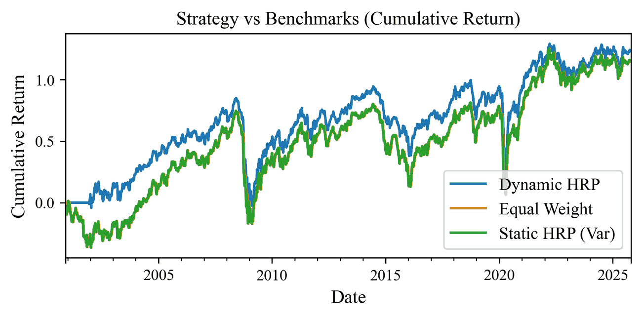
Cumulative return, 2001–2025. The dynamic strategy opens its lead early and holds it, but the equal-weight and static HRP lines are indistinguishable across the whole sample.
Where the gain comes from — and where it doesn't
Splitting returns by detected regime tells a more complicated story than the headline numbers.
Mean weekly return by regime. Dynamic HRP wins clearly when trending and loses in crisis, which is the opposite of the design intent.
Regime
Strategy
Mean
Std. dev.
Weeks
Trending
Dynamic HRP
+0.00219
0.0276
548
Trending
Equal weight
+0.00166
0.0308
548
Trending
Static HRP
+0.00147
0.0309
548
Neutral
Dynamic HRP
+0.00196
0.0275
381
Neutral
Equal weight
+0.00211
0.0298
381
Neutral
Static HRP
+0.00103
0.0324
381
Crisis
Dynamic HRP
−0.00191
0.0322
368
Crisis
Equal weight
−0.00151
0.0360
368
Crisis
Static HRP
−0.00013
0.0337
368
The whole outperformance is earned in the trending state. In crisis weeks the dynamic strategy is the worst of the three on mean return — which is precisely the regime the CVaR switch was built to handle.
It is not a total failure of the idea. Dynamic HRP has the lowest volatility in every single regime, including crisis, so the CVaR objective is doing something: it is suppressing dispersion rather than protecting the mean. But the design intent was defensive allocation that loses less when things break, and on this evidence it loses slightly more while shaking less. Either the CVaR objective is the wrong tool, or the regime label arrives too late to act on — the crisis state is identified largely from the VIX, which rises during the drawdown rather than before it.
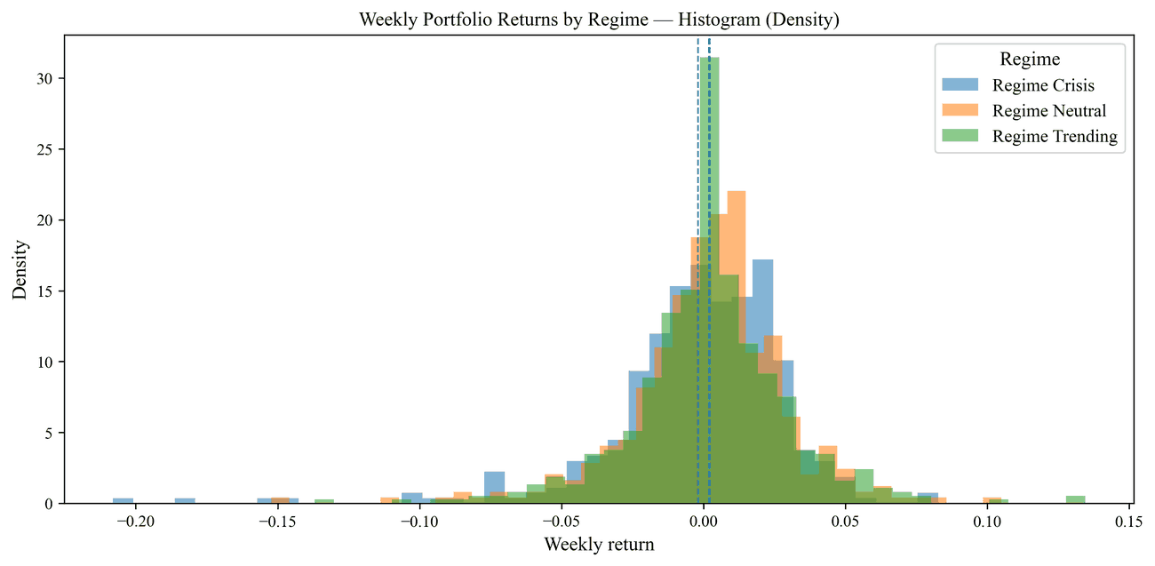
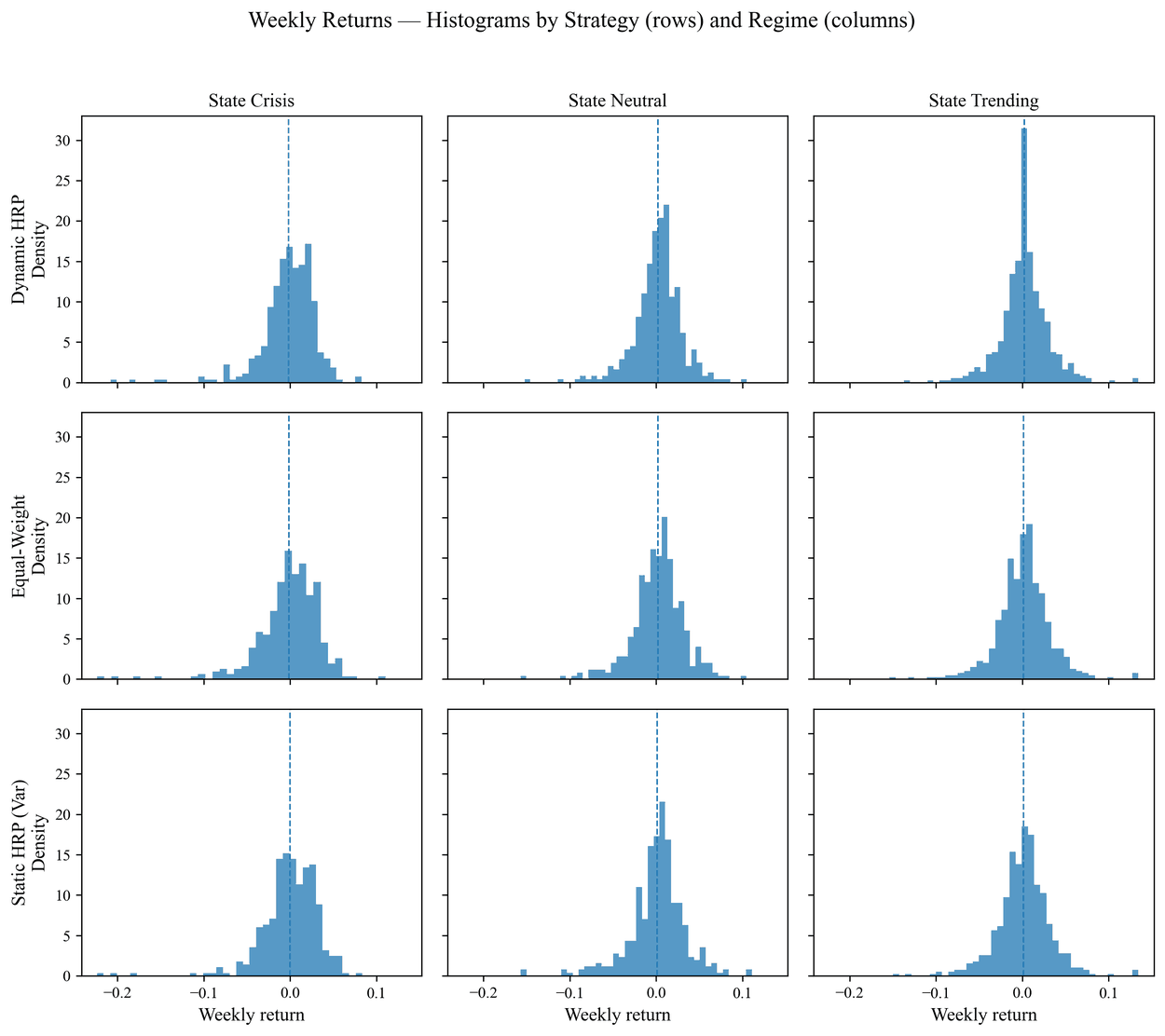
Return density by regime. Crisis weeks show the fatter left tail; the distributions otherwise overlap heavily, which is why separating them statistically is difficult.The same weekly returns broken out by strategy and regime. Dynamic HRP is visibly the most concentrated distribution in every column.
Is the improvement real?
The cumulative return chart makes the gap look convincing. Testing it directly makes it look considerably less so.
Test
Statistic
P-value
Paired t-test
0.0528
0.479
Wilcoxon signed-rank
430,170
0.277
Bootstrap
—
0.484
All three test whether dynamic HRP's mean weekly return exceeds static HRP's. None comes close to rejecting the null. With 1,297 weekly observations and a difference in weekly means of around six basis points against a standard deviation near 3%, there is simply not enough signal to distinguish the two series — a visible gap in a cumulative chart can be produced by a difference far smaller than the week-to-week noise.
So the honest summary is: the point estimates favour regime conditioning consistently, across return, volatility, drawdown, and deflated Sharpe, and the effect concentrates in exactly one regime. But the sample cannot rule out that it is chance.
Open questions
The crisis result needs explaining. The CVaR switch reduces volatility but not losses. Testing whether the regime signal simply arrives late — by lagging the label deliberately, or by triggering on the VIX change rather than its level — would separate a bad objective from bad timing.
Static HRP and equal weight are indistinguishable in aggregate. Their overall statistics coincide and their cumulative return lines overlap, even though the per-regime breakdown shows them diverging. That needs confirming before either is trusted as a benchmark.
The HMM may be doing less work than it appears. With the classification driven mostly by VIX level and change, a volatility-threshold rule is the benchmark the HMM should have to beat.
Transaction costs are not modelled. Regime switching trades more than a static rule by construction, and none of that is charged for here.
Non-price features. Feeding macro and sentiment data into the regime model would give it something to read other than realised volatility.
Stack
Python 3.9 with pandas, numpy, scipy, scikit-learn, hmmlearn, and matplotlib. Structured as an installable package with separate modules for data loading, universe selection, signals, features, walk-forward HMM inference, HRP allocation, backtesting, and performance statistics.
The carry trade is the oldest free lunch in currency markets and the one most reliably followed by a bill. Borrow in a currency with low interest rates, hold one with high rates, and collect the difference every day the exchange rate stays put. It works for months at a time. Then it stops working in about a week.
That asymmetry — slow accumulation, violent reversal — is thoroughly documented. What is harder is the timing. This project asks whether the currency options market prices the reversal before the spot market delivers it: if traders are quietly bidding up crash protection ahead of an unwind, that willingness to pay should be visible in the shape of the volatility smile, and it should be visible early.
Why AUD/JPY
AUD/JPY is the carry trade in its purest available form. The yen has spent most of the last two decades as the world's cheapest funding currency, and the Australian dollar is a high-yielding, commodity-linked, risk-sensitive currency on the other side. When risk appetite is healthy the pair grinds higher and the position earns its interest differential; when risk appetite fails, the yen strengthens and the pair falls hard. Anything true of carry generally should be visible here first.
The data is weekly, spanning 2008 to 2025 — roughly 940 observations, which is long enough to include the global financial crisis, the 2013 taper tantrum, the 2016 risk-off episodes, the COVID crash, and the 2022–24 policy divergence between the RBA and the Bank of Japan.
Measuring the carry
Carry is computed from the one-month outright forward against spot rather than from published policy rates. Covered interest parity means the forward already contains the market's actual funding differential, including the balance sheet and credit frictions that a central bank policy rate ignores.
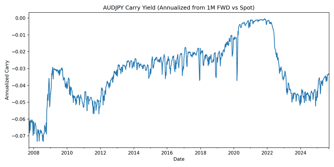
Annualised carry implied by the 1M forward. Negative under this convention because AUD rates exceeded JPY rates — a long AUD/JPY position funded in yen earns the gap, so a more negative reading means a wider carry.
The path is a policy history in one line. The carry is wide through the post-crisis years, compresses almost to nothing between 2020 and 2022 when the RBA cut to the effective lower bound and the differential disappeared, then reopens sharply from mid-2022 as the RBA hikes into inflation while the Bank of Japan holds. The trade's entire economic rationale switches off and back on inside three years.
The shape of the payoff
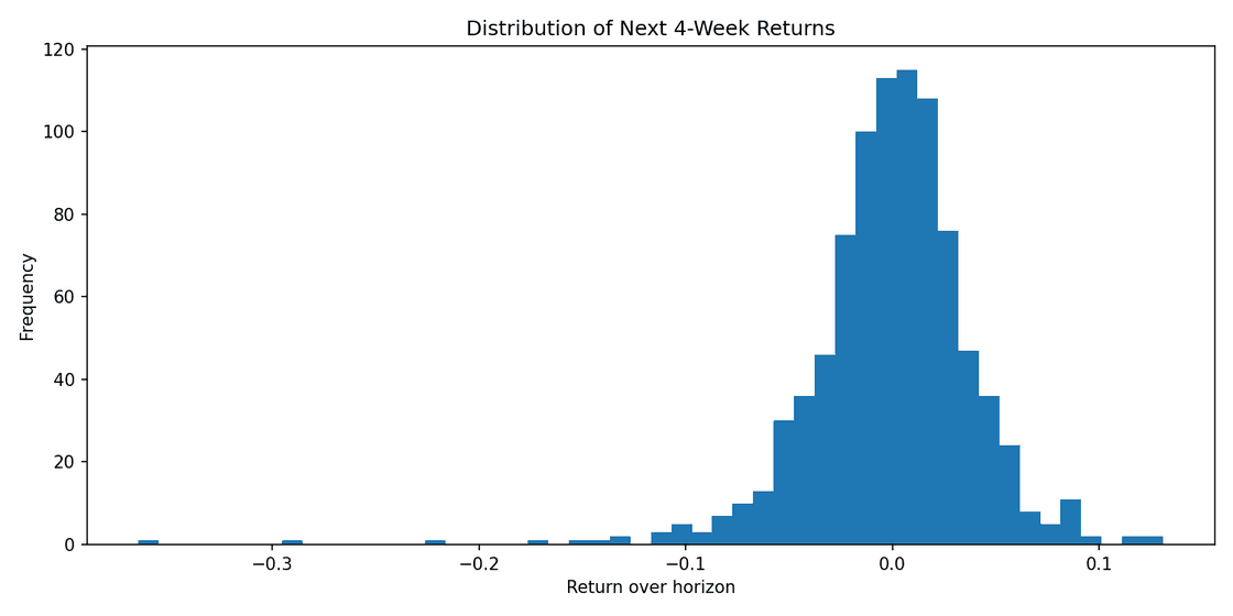
Total return combines the spot move with the accrued carry, and the distribution of four-week forward returns shows exactly the profile the strategy is famous for.
Four-week forward total returns. A tight, slightly positive core with a long left tail reaching past −30% — the crashes are rare, and they are enormous.
The mass sits marginally above zero and the tail runs only one direction. A strategy with this shape can post an excellent Sharpe ratio for years and still be a bad trade, because the metric assumes a symmetry the returns do not have. Which is precisely why an early-warning signal would be worth having: the problem is not the average outcome, it is the left tail.
The signal
The 25-delta risk reversal is the price of an out-of-the-money call minus the price of an out-of-the-money put at equal delta. It measures the skew of the volatility smile — which side of the distribution the market is paying up to insure against. When traders fear an AUD/JPY collapse, downside puts get bid relative to upside calls and the risk reversal moves accordingly.
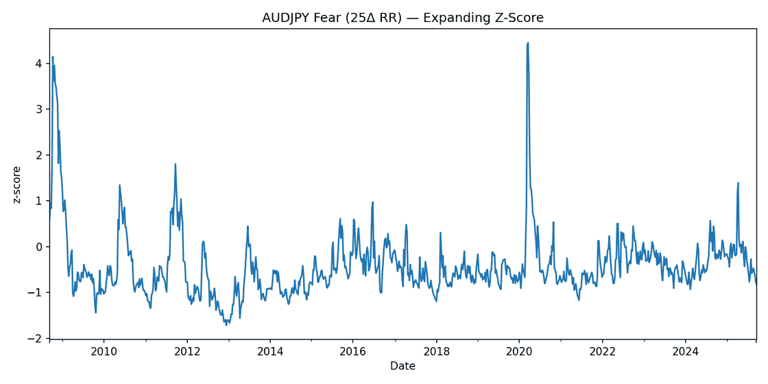
It is converted to an expanding z-score, using only data available up to each date, so no observation is standardised against a mean it could not have known. Using a full-sample mean here would be a subtle but complete invalidation of the exercise.
Fear, as an expanding z-score. The 2008 crisis and the March 2020 COVID crash both register above four standard deviations; 2010, 2011 and 2025 show smaller spikes.
The predictor is the weekly change in this z-score, not its level. The level is highly persistent — fear stays elevated for months after a shock, which makes it a description of where the market has been rather than a signal about where it is going. The change isolates the moment of repricing, which is the thing that might actually lead.
Result
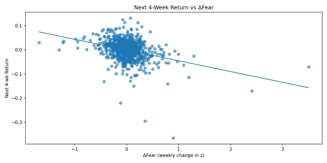
Regressing the next four weeks of total return on the current week's change in fear gives a clearly negative relationship.
Next four-week return against ΔFear. The fitted line slopes down throughout, but the cloud around it is very wide.
Read off the fitted line, a one-standard-deviation weekly jump in fear corresponds to roughly four percentage points of lower return over the following four weeks — economically large, if it holds. But the dispersion around the line is enormous, and the fit is visibly driven in part by a handful of extreme observations on both ends. The direction is convincing; the precision is not.
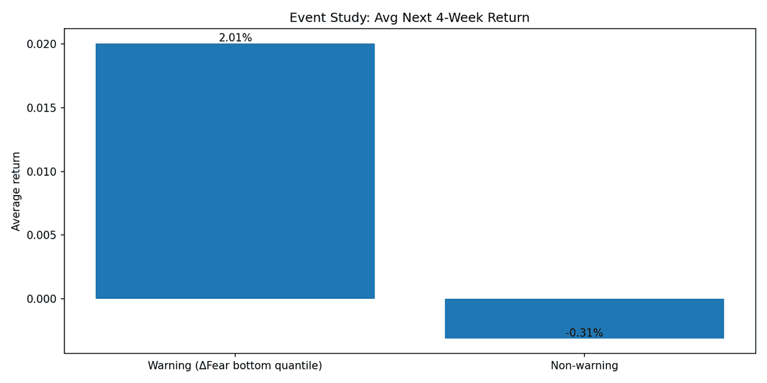
Splitting the sample into buckets rather than fitting a line gives the same answer in a form that is harder to argue with.
Event study. The left bar is the bottom quantile of ΔFear — weeks when fear receded most sharply — which is followed by +2.01% on average against −0.31% elsewhere.
Fear receding+2.01%
All other weeks−0.31%
Spread2.32 pts
Sample~940 weeks
The bucket where fear falls most sharply is followed by an average four-week return of 2.01%, against −0.31% for everything else — a spread of more than two percentage points over a one-month horizon. This is the same finding as the regression, seen from the other end: because ΔFear and forward returns move inversely, the weeks when protection gets cheaper are the weeks that precede the strongest carry performance.
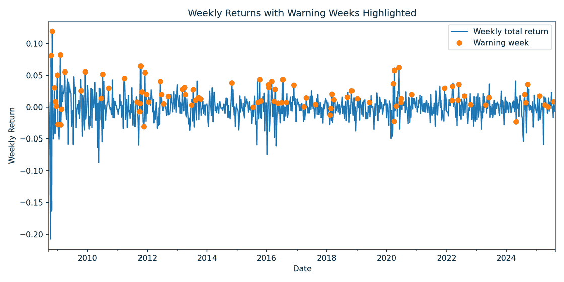
Flagged weeks against the return series. They cluster in and immediately after stressed periods — 2008–09, 2011–12, 2016, and March 2020 — rather than spreading evenly through the sample.
The clustering is worth noting on its own. Flagged weeks are not scattered uniformly through time; they bunch during and just after periods of stress, when fear has spiked and is now unwinding. That is a real property of the signal and also a warning about the statistics: a few hundred flagged observations concentrated into a handful of episodes carry far less independent information than their count suggests.
What would have to be true for this to be tradeable
Several things this analysis does not yet establish.
The standard errors are wrong as they stand. Four-week forward returns sampled weekly overlap by three quarters, so consecutive observations share most of their data. Ordinary standard errors will be badly understated. Newey–West or another HAC correction is required before any p-value here means anything, and given the episode clustering above, I would expect the corrected interval to be much wider.
One pair is one observation. The result is fitted on AUD/JPY alone. If the mechanism is real it should replicate in the other classic carry crosses — NZD/JPY, AUD/CHF — and the honest test is whether a signal calibrated on one pair works on the others without re-tuning.
Nothing here is out of sample. The relationship is estimated over the full history. A walk-forward test, where the signal is built only from prior data and evaluated on what follows, is the minimum bar before calling it predictive.
The costs are not modelled. Acting on this means trading a two-currency position, and the option prices used to build the signal carry bid–ask spreads that widen exactly when the signal fires.
The two-percentage-point spread is an average, not a rule. Given a left tail that reaches past −30%, an average edge of that size can be consumed by a single bad episode.
The repository also contains a parallel machine learning treatment of the same dataset. Running both matters: if a flexible model finds nothing beyond what the linear specification already shows, that is evidence the relationship is genuinely simple rather than evidence the linear model was too crude to see it.
Stack
Python with pandas, numpy, statsmodels, scikit-learn, and matplotlib. Weekly AUD/JPY spot, one-month outright forwards, and 25-delta risk reversal quotes.
Coca-Cola and Pepsi sell nearly the same product to nearly the same people, so their share prices ought to move together, and when they drift apart the gap ought to close. That is the entire premise of a pairs trade, and it is easy to find pairs where it has held historically. The harder question — the one this simulator exists to answer — is whether the gap closes fast enough, relative to how much it wanders in the meantime, to be worth trading.
The answer for this pair turned out to be no, and the reason is specific enough to be worth showing.
The spread
The traded quantity is the dollar spread between Pepsi and a beta-scaled position in Coca-Cola:
St = PEPt − β·KOtβ = 2.5843
The hedge ratio is estimated on price levels, since the position is held in dollar terms and it is the dollar spread that has to revert. Log-price and return betas were computed as references (1.2381 and 0.7727) but not used to size the trade — they answer a different question, and mixing them up is a good way to build a hedge that is neutral to something other than what you are actually exposed to.
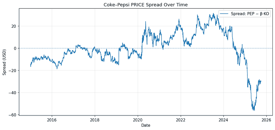
The dollar spread, 2015–2025. Range-bound for most of the decade, then a decisive break downward through 2024–25.
That last stretch is the first warning. Through 2024 and into 2025 the spread does not oscillate around a level — it leaves, falling from roughly +20 to below −55 and staying there. Whatever relationship held for the previous nine years stopped holding. Any strategy calibrated on a fixed long-run mean would have spent that entire period adding to a losing position.
Two models of the same pair
Rather than assume a data-generating process, I calibrated two and compared what they imply.
Model A treats both stocks as correlated geometric Brownian motions. There is no mean reversion anywhere in this specification — the spread wanders freely. It is the null hypothesis: what the trade looks like if the pairs premise is simply false.
Parameter
KO
PEP
Drift μ
0.0577
0.0549
Volatility σ
0.1793
0.1911
Correlation ρ
0.7251
Model B keeps KO as a GBM and models the spread itself as an Ornstein–Uhlenbeck process. This is the pairs-trading hypothesis stated formally: the spread is pulled back toward a long-run level at a rate set by κ, with diffusion σS pushing it around in the meantime.
dSt = κ(θ − St)dt + σS dWt
Parameter
Value
Meaning
κ
0.6227
Mean-reversion speed, per year
θ
−2.4239
Long-run spread level, dollars
σS
18.9100
Diffusion, dollars per √year
b
0.9975
AR(1) persistence coefficient
Corr
−0.2879
KO returns against spread shocks
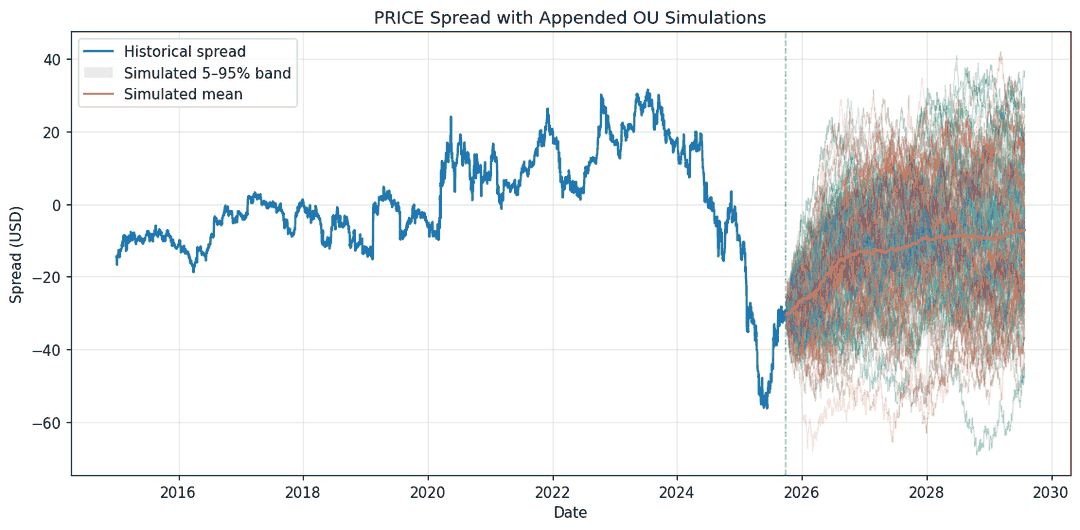
Simulated OU paths appended to the historical spread. The mean pulls upward toward θ — slowly — while the 5–95% band opens far faster.
The half-life problem
Read κ = 0.6227 as a half-life and the strategy's central difficulty appears immediately:
half-life = ln(2) / κ = 1.11 years ≈ 281 trading days
The spread takes over a year to close half of any given gap. A 60-day hold captures 13.8% of it; a 5-day hold captures 1.2%. Meanwhile the diffusion accumulates with the square root of time, which at short horizons is much faster than the reversion arrives.
Expected reversion against accumulated noise, from the calibrated parameters, for a spread starting $27 from its long-run level. Noise dominates at every horizon a trader would actually hold.
At 60 days the expected move is about $3.78 against a standard deviation of $8.58 — a signal-to-noise ratio of 0.44. The reversion is real and it is measurable. It is also far too slow to be traded at the horizons the simulator tests.
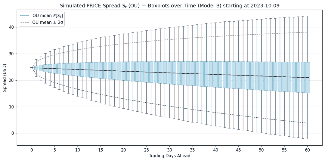
The same result seen distributionally: the median barely moves over 60 days while the interquartile range widens steadily.
What the simulator says about a specific trade
Taking an entry on 9 October 2023 — long 619.73 shares of PEP at $161.36 against 1,891.07 shares of KO short at $52.88, a long-spread position entered while the spread sat well above its long-run level — and pushing it through both models:
Horizon
Model
E[PnL]
5th pct.
95th pct.
Day 5
Correlated GBMs
−6.55
−3,191
3,191
Day 5
OU + GBM
−224.73
−2,992
2,543
Day 60
Correlated GBMs
−58.98
−11,192
11,271
Day 60
OU + GBM
−2,519.76
−11,537
6,510
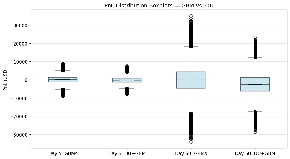
Model A produces a distribution centred on approximately zero, which is exactly right — a driftless spread trade has no edge, only variance. Model B produces a materially negative expectation, and the reason is mechanical: the position is long a spread that the OU model expects to fall. Multiplying the 60-day expected spread move by the PEP position size recovers roughly −$2,342 of the reported −$2,519.76, with the remainder coming from the KO leg.
That agreement is the useful part. The simulator is not forecasting a price; it is pricing a position against a stated model of the world, and here it says the trade is negative expected value before a dollar is committed.
PnL distributions under both models. The 60-day boxes are enormous relative to their medians in both specifications.
The trading rule
The OU parameters are re-estimated on a rolling 30-day window rather than fixed, because the spread is plainly not stationary over a decade — the 2024–25 break makes that visually obvious, and a fixed θ would have been wrong for years at a time. Bands are built from the one-step-ahead conditional mean and standard deviation:
Long the spread (buy PEP, sell KO) when St falls below the lower band — Pepsi cheap relative to Coke
Short the spread (sell PEP, buy KO) when St rises above the upper band
Exit when the spread re-enters a tighter inner band at zexit
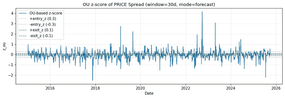
Final configuration: a 30-day window, entry at z = 0.3, exit at z = 0.1, forecast-mode bands. Those entry thresholds are deliberately tight. Given how slowly this spread reverts, waiting for a two-sigma dislocation would produce almost no trades at all.
The OU z-score against its entry and exit thresholds. Because the bands rebuild every day from a 30-day window, they track the spread rather than anchoring to a fixed mean.
Backtest
Trades166
Mean per trade$273
Total realized$45,366
5th–95th±$3.5k
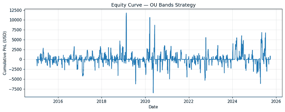
Cumulative realized PnL. Positive overall, and dominated throughout by a handful of large individual outcomes in both directions.
166 trades, $273 average, $45,366 total. The dispersion is the number that matters: a 5th-to-95th percentile range of roughly −$3,171 to +$3,949 around a $273 mean means individual trade outcomes are more than an order of magnitude larger than the edge being harvested. A rough standard-error check on the per-trade mean puts it near the boundary of statistical significance rather than comfortably past it — and that is before any transaction costs, borrow costs on the short leg, or slippage, none of which are modelled here.
What I would fix
Match the holding period to the half-life. The most direct conclusion from the calibration is that 5- and 60-day horizons are the wrong ones for a spread with a 281-day half-life. Testing holds measured in quarters would at least let the reversion arrive.
Screen pairs on κ, not on correlation. KO and PEP correlate at 0.73, which is what makes them look like a textbook pair. Reversion speed is the parameter that determines tradability, and it is not implied by correlation at all.
Test the structural break directly. The 2024–25 move should be examined with a formal cointegration test over rolling windows to establish whether the relationship broke or merely stretched.
Cost the trade properly. 166 round trips in a two-leg position with a short leg is a meaningful cost base, and the per-trade edge is small enough that costs could plausibly consume all of it.
Report per-trade significance. With trade-level PnL already available, a bootstrap on the mean would replace the eyeball test with a number.
Stack
Python with numpy, pandas, and matplotlib. Maximum-likelihood OU calibration via the AR(1) representation, Monte Carlo simulation of both specifications, and a rolling-window backtest of the band strategy.
Every factor model is a bet about which sources of systematic risk actually explain a stock's returns. Include too few and you miss real exposures; include too many and you start fitting noise, then hand that noise to an optimiser that treats it as information.
I wanted to know whether the model that explains history best is the model you should actually invest with. So I built four, ranked them by statistical fit, ranked them again by what their portfolios earned, and compared the two orderings.
They came out backwards.
Setup
20 U.S. stocks, monthly adjusted closing prices, December 2005 to December 2016
Eight Ken French factors: market, size, value, profitability, investment, momentum, short-term reversal, long-term reversal
All models estimated on excess returns, so the intercept measures compensation above the risk-free rate
Four-year rolling calibration (48 observations), annual rebalancing, five out-of-sample investment years from 2012 through 2016
Each model produces an expected return vector and a covariance matrix, and both go into the same optimiser — so any difference in portfolio outcome is attributable to the estimates rather than to the optimisation.
μi = αi + βiᵀ𝔼[f] Q = BᵀΣfB + D
Σf is left unrestricted. The eight factors are built from overlapping stock universes and are meaningfully correlated with one another, so zeroing the off-diagonals would understate covariance for any two assets loading on related factors — and the optimiser would then build a portfolio that only looks diversified.
Four ways to choose factors
OLS uses all eight, unrestricted. Maximum flexibility, maximum exposure to overfitting — eight correlated regressors against 48 observations is not a comfortable ratio.
Fama–French uses three: market, size, value. The restriction is theoretical rather than statistical. Three decades of literature say these are not spurious, and imposing that prior means the data never gets the chance to talk you into something.
LASSO selects factors per asset through an L1 penalty, so a stock driven by momentum and a stock driven by value can end up with genuinely different models.
minB ‖ri − XBi‖²₂ + λ‖Bi‖₁
λ was fixed on the first calibration window and then held constant across all five periods, chosen to leave two to five non-zero coefficients per asset. Holding it fixed is the conservative choice: re-tuning at each rebalance would be more responsive but risks leaking information backwards.
λ
Avg. non-zero coefficients per asset
0.001
8.60
0.005
7.35
0.010
6.30
0.020
4.80
0.050
3.05
0.100
2.15
Best Subset Selection solves the sparsity problem directly rather than through a convex relaxation, constraining the number of non-zero coefficients to at most four and searching exhaustively over every subset.
minB ‖ri − XBi‖²₂ s.t. ‖Bi‖₀ ≤ 4
With only nine candidate coefficients the exhaustive search is cheap, and unlike LASSO or stepwise selection it returns the provably optimal subset. That guarantee turns out to matter, though not in the direction I expected.
Ranking one: statistical fit
Adjusted R², averaged across the 20 assets, penalising each model for the number of parameters it actually uses — eight for OLS, three for Fama–French, and whatever LASSO and BSS select per asset.
Calibration window
OLS
FF3
LASSO
BSS
2008–2011
0.4797
0.4358
0.3998
0.4996
2009–2012
0.4767
0.3984
0.3373
0.4811
2010–2013
0.4364
0.3473
0.2603
0.4530
2011–2014
0.3974
0.2800
0.1854
0.4298
2012–2015
0.4393
0.3411
0.1982
0.4666
Mean
0.4459
0.3605
0.2762
0.4660
Adjusted R² across the five calibration windows. BSS wins every one; LASSO degrades sharply as the fixed λ ages.
BSS wins every single window. It beats OLS despite using at most four coefficients against OLS's eight, which is exactly what the adjusted R² penalty is designed to reward — more explained variation per parameter spent. LASSO comes last and gets worse over time, which is the cost of freezing λ on a 2008–2011 window and then applying it through 2015.
On fit alone, the ranking is unambiguous: BSS, OLS, FF3, LASSO.
Ranking two: what the portfolios earned
The same four sets of estimates, the same optimiser, five years out of sample.
Metric
OLS
FF3
LASSO
BSS
Annualised return
8.54%
8.55%
8.53%
7.04%
Annualised volatility
9.09%
9.11%
9.25%
9.15%
Sharpe ratio
0.9323
0.9324
0.9160
0.7626
Total return
48.95%
49.06%
48.81%
38.39%
The ranking inverts. BSS, which fit best in all five windows, produces the worst portfolio on every measure — a Sharpe ratio 18% below the leaders and about ten percentage points of cumulative return given away over five years.
The other three are, honestly, indistinguishable. A Sharpe gap of 0.0164 between OLS and LASSO over five years of monthly data is noise, and I would not defend any claim that one of those three beat the others. The finding is not that some particular model won. It is that the one model with a clear statistical edge lost.
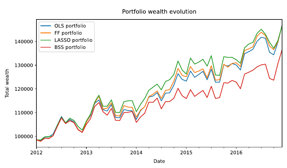
The two rankings against each other. If in-sample fit predicted portfolio performance the points would trend upward to the right.Wealth evolution from $100,000. Three portfolios track each other closely; BSS separates downward from early 2014 and never recovers.
Why the best fit loses
The mechanism is estimation error, and it is worth being precise about where BSS is exposed and LASSO is not.
Both produce sparse models. But LASSO shrinks the coefficients it keeps — the L1 penalty pulls every surviving loading toward zero, which is a second, continuous form of regularisation on top of the selection. BSS applies no shrinkage whatsoever. It chooses a subset, then fits plain OLS on it. Whatever noise the selected factors happened to capture in those 48 months is carried into μ at full strength.
That matters because mean–variance optimisation is an error maximiser. It allocates most aggressively to whichever asset has the highest estimated return relative to its estimated risk, so a μ that is confidently wrong is worse than a μ that is vaguely right. BSS is confidently wrong: it has found the genuinely optimal subset for explaining the calibration window, including the parts of that window that were luck.
Adjusted R² cannot see this. It penalises parameter count, not the reliability of the coefficients attached to them — and BSS is being rewarded for using few parameters precisely while it fits each of them unshrunk.
What the weights show
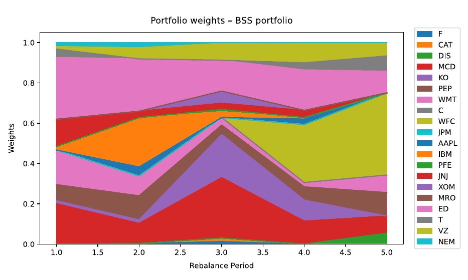
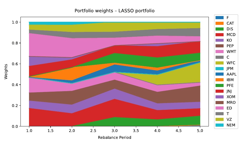
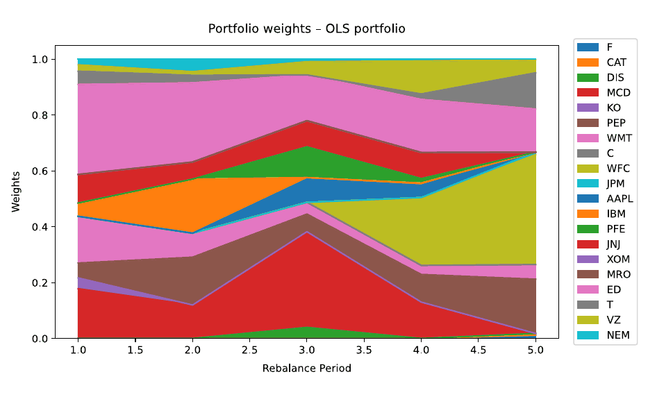
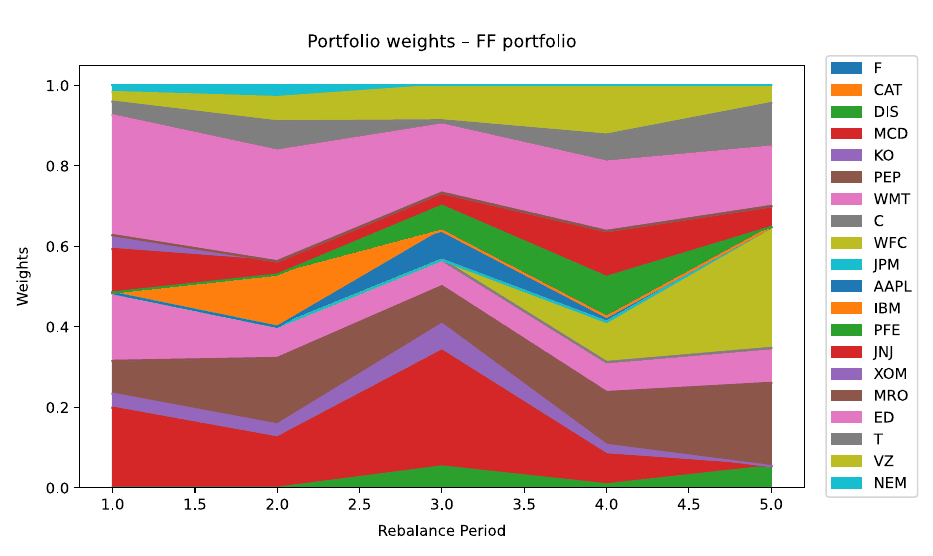
The allocation paths make the instability visible. All four portfolios are long-only and fully invested, so differences come entirely from the estimates.
BSS weights. Large blocks appear and vanish between rebalances — a near-total rotation out of IBM after period two, and a heavy swing into WFC by period five.LASSO weights, by contrast: more names held, and positions that persist across rebalances rather than being rebuilt.OLS weights.Fama–French weights — the most stable of the four, which is what imposing a fixed three-factor structure buys.
What I would fix
Shrink the BSS coefficients. The obvious test of the diagnosis above is to apply Ridge to whatever subset BSS selects. If the underperformance is unshrunk estimation error, that should close most of the gap — and it is the approach I went on to use in the follow-up project, where Ridge plus covariance shrinkage did beat its benchmarks.
Ledoit–Wolf on the covariance. The factor decomposition already provides some structure, but 48 observations against 20 assets leaves the sample covariance badly conditioned.
Re-tune λ and K per window. Both were fixed on the first calibration period. LASSO's steady decline in adjusted R² is the visible cost of that choice, and a properly nested cross-validation would avoid the look-ahead concern that motivated freezing them.
Add position limits. Nothing here caps individual weights, which is why the allocations swing as hard as they do between rebalances.
Five years is not enough. Five annual rebalances is five observations of the thing actually being measured. The direction of the result is consistent across every window, but the sample cannot carry much more weight than that.
Stack
Python with numpy and pandas, CVXPY and the CLARABEL solver for the LASSO subproblems and the mean–variance program, and exhaustive enumeration for best subset selection.
Mean–variance optimisation has a well-known failure mode: it is an error maximiser. Feed it slightly wrong expected returns and it will happily concentrate the entire portfolio into whichever asset the noise happened to flatter. The mathematics is sound; the inputs are the problem.
This project builds a semi-annually rebalanced long-only equity portfolio and asks a narrow version of that question — if the instability comes from estimation error, does regularising the estimates rather than the optimiser fix it? The benchmark to beat is equal weighting, which is immune to estimation error precisely because it estimates nothing, and which is notoriously difficult to outperform out of sample.
There is a second objective in tension with the first. The strategy is scored on risk-adjusted return and on turnover. Any model that responds quickly to new information trades more; any model that trades less is slower to act on what it knows.
Setup
20 U.S. equities, monthly adjusted closing prices, December 2001 to December 2016
First 60 months reserved for calibration and excluded from scoring; evaluation runs from January 2007
Rebalancing every six months, walk-forward, with no data available to the model that would not have existed at the time
Adjusted rather than raw closing prices, since a stock split would otherwise register as a large loss that no investor actually experienced. All factor models are fit on excess returns so the intercept reflects compensation above the risk-free rate rather than a blend of risk premia and the time value of money.
Why the factors fight back
The eight factors are built from overlapping universes of stocks, so they are correlated with each other — market, momentum, and profitability especially. Two consequences follow, and both shaped the design.
First, the off-diagonal elements of the factor covariance matrix are not zero and cannot be dropped. Assuming orthogonal factors would understate covariance wherever two assets load on correlated factors, and the optimiser would build a portfolio that looks more diversified than it is.
Qfactor = V̂ᵀ Σf V̂ + D
Second, correlated regressors inflate the variance of individual OLS coefficients. The joint fit can look fine while every individual loading is unreliable — and those loadings propagate straight into both the expected returns and the covariance matrix.
Two regularisers
Ridge on the factor loadings. An L2 penalty shrinks the loadings toward zero and makes the system strictly positive definite for any penalty above zero, which removes the ill-conditioning outright. The intercept is recovered analytically afterwards so it escapes the penalty.
V̂ridge = (FcᵀFc + αI)⁻¹ FcᵀRc
Ridge rather than LASSO, because the goal was never factor selection — all eight have theoretical motivation — but stabilisation of loadings under multicollinearity.
Shrinkage on the covariance. The standard Ledoit–Wolf estimator shrinks the sample covariance toward a scaled identity. That works, but the identity is an uninformative target: it asserts that all assets are uncorrelated and equally volatile. This version shrinks toward the factor-model covariance instead.
Q̂ = (1 − w)·S + w·Qfactor
The claim being made is a specific one: to the extent that the sample covariance is unreliable, resolve the uncertainty in the direction of the Fama–French structure rather than toward isotropy. Validation selected w = 0.7, meaning the structured prior was doing most of the work.
The full estimation and allocation pipeline, re-run at each of the semi-annual rebalancing dates.
Portfolio construction
Weights come from a convex quadratic program, solved with CVXPY and the CLARABEL interior-point solver, so the global optimum is found at every rebalancing date with no sensitivity to initialisation.
maxx μᵀx − (γ/2)·xᵀQx s.t. Σxi = 1, xi ≥ 0, xi ≤ xmax
Long-only, fully invested, with a per-asset cap. The cap does real work: it prevents the optimiser from expressing estimation noise as a concentrated bet.
The turnover penalty that did not survive
An L1 penalty on weight changes was added to the objective — L1 rather than L2 because it produces sparse updates, leaving many weights exactly unchanged, which is what actually reduces measured turnover.
maxx μᵀx − (γ/2)·xᵀQx − λ‖x − xprev‖₁
It worked, and it was still the wrong trade. Every level of penalty that meaningfully reduced turnover cost more in Sharpe ratio than it gained. Since the scoring weighted risk-adjusted return at 80% against turnover at 20%, the final configuration sets λ = 0 and relies on the natural stability of the Ridge and Ledoit–Wolf estimates to keep weight changes moderate. Reporting a component that was built, tested, and then deliberately switched off seemed more useful than quietly dropping it.
Guarding against fooling myself
Selecting hyperparameters on the same data used to calibrate the model produces optimistic results, so the out-of-sample period was split three ways: a training segment for calibration, a validation segment for grid search, and a test segment evaluated exactly once after the parameters were frozen.
A consistent pattern across the mean–variance strategies: a 48-month window with a tight 10% position cap beat longer windows and looser caps. The portfolio benefits more from concentration control than from additional history.
Results
Six strategies, evaluated under the full walk-forward procedure across the entire investment horizon.
Ridge + LW posts the highest Sharpe ratio, though the margin over equal weighting is narrow.
Sharpe — Ridge + LW0.1991
Best benchmark0.1750
Equal weight0.1653
Turnover0.5213
Strategy
Sharpe
Turnover
Ridge + LW
0.1991
0.5213
Historical Max Sharpe
0.1750
0.3850
Equal Weight
0.1653
0.1170
Historical MVO
0.1606
0.4654
OLS MVO
0.1546
0.4590
Risk Parity
0.1518
0.1788
Ridge + LW beats both unregularised mean–variance strategies, which is the result the design predicted: stabilising the loadings and conditioning the risk model produces better optimiser inputs. It also beats equal weighting, modestly — and modestly is worth something against a benchmark that is hard to beat by construction.
It also trades the most, by some distance.
The cost of responsiveness. Ridge + LW earns the highest Sharpe ratio and pays for it in turnover; equal weight and risk parity sit in the opposite corner.
The result that disagreed
On the single held-out test segment, the ordering inverted. Ridge + LW came last among the model-based strategies at 0.1796, while Historical Max Sharpe led at 0.3220 and risk parity took second.
Strategy
Test Sharpe
Turnover
Historical Max Sharpe
0.3220
0.2924
Risk Parity
0.2865
0.1730
Equal Weight
0.2538
0.1025
OLS MVO
0.2246
0.4098
Historical MVO
0.2239
0.4298
Ridge + LW
0.1796
0.5226
That segment is one contiguous slice of market history, roughly the last fifth of the sample, and a single window of that length has very little power to separate strategies whose Sharpe ratios differ by a few hundredths. Return-agnostic approaches like risk parity and equal weight do well in low-dispersion environments because they never try to forecast and therefore cannot be wrong. Historical Max Sharpe optimises the exact quantity being scored, which flatters it in-period and tends to break down elsewhere.
The honest reading is that one sub-period is a diagnostic, not a verdict, which is why the full walk-forward evaluation is the number that counts. But it is a genuine caution about how much of the walk-forward margin is signal.
What I would fix
Expected returns are still the weak link. Ridge stabilises the loadings, but μ still depends on the sample mean of factor returns, which is very noisy at monthly frequency. Black–Litterman or James–Stein shrinkage on μ itself is the obvious next step.
No regime awareness. The same model structure applies whether markets are calm or in crisis. A regime-switching layer could allocate defensively under stress — the approach I went on to build in the Dynamic HRP project.
Turnover is controlled only indirectly. An explicit transaction cost term in the objective would likely dominate the blunt L1 penalty that was tested and discarded.
Hyperparameters were tuned on one dataset. Averaging across several would generalise better than a single grid search, at the cost of compute.
Risk parity as an ensemble component. It is return-agnostic and low-turnover, and could act as a fallback when factor forecasts are unreliable — though deciding when to switch introduces its own model-selection problem.
Stack
Python, CVXPY with the CLARABEL solver for the convex programs, SciPy SLSQP for the non-convex maximum-Sharpe and risk-parity formulations, scikit-learn for Ridge and Ledoit–Wolf, pandas and numpy throughout.
Résumé
Alexander Khadra
Education
Aug 2025 — Jul 2026
Master of Mathematical FinanceUniversity of Toronto · Toronto, Canada
cGPA 3.9 / 4.0
Jul 2025 — Aug 2025
Summer Program in Sustainable AIADIA Lab Summer School · Shanghai, China
Sep 2019 — May 2024
BSc, Mathematics and EconomicsUniversity of British Columbia · Vancouver, Canada
Certifications
2025
CFA ProgramPassed Level I · Level II candidate
2025
Bloomberg Market Concepts
Experience
Jan 2026 — Apr 2026
Quant Analyst InternRBC Capital Markets · Toronto
Implemented model-driven valuation of swaps and fixed income instruments by integrating market curves and discounting cash flows, contributing to pricing accuracy and daily P&L processes.
Automated daily P&L calculations and reporting delivered directly to traders, improving transparency and timeliness.
Investigated unexpected P&L movements by decomposing effects from market moves, accruals, and system behaviour.
Jul 2024 — Jul 2025
Research AssistantBank of Canada · Ottawa
Developed and refined asset pricing models to analyze liquidity premiums, isolating their impact from other pricing factors and demonstrating an annual return spread of 5.91% between the least and most liquid portfolios after controlling for confounding variables.
Modelled how the decline in average U.S. inflation from 8% to under 3% (1983–2001), along with falling mortgage rates, explains over 50% of the rise in household mortgage debt.
May 2023 — Dec 2023
Data Science InternBoeing Co. · Vancouver
Constructed and re-trained predictive maintenance models by retraining RoBERTa, predicting which aircraft components needed repairs from written reports at 95% accuracy.
Developed a model to forecast active runways and their direction 24 hours in advance at roughly 70% accuracy, integrating weather conditions, runway usage, and special events.
Jan 2023 — Apr 2023
Data Science InternUBC Data Science Institute (BC Cancer) · Vancouver
Created NLP models using ClinicalBERT to identify cancer characteristics and related elements from medical reports at 90% accuracy.
May 2021 — Aug 2021
Data Analyst InternDeloitte (Ouest Business Solutions) · Vancouver
Developed dashboards for clients to view their financials, including accounts payable and receivable.
Open to quantitative research, trading, and structuring roles, and always happy to talk through a modelling problem. Email is the fastest way to reach me.